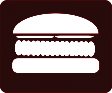
Down with the hamburger!
No, not the hamburgers we eat. I'm talking about that over-used little icon that you see on a lot of mobile sites.
 Yes! That one.
I came across an article on Tech Crunch a while ago, titled "Kill the Hamburger Button Before it Kills You" by Anthony Rose. Anthony argued that the Hamburger Button was lowering site traffic; the reasoning behind this is very similar to "outta sight, outta mind". If the user cannot see it, then they may not even be aware that it exists. His article cited quite a few studies, most notably a study by The Next Web (TNW).
TNW did an A/B test (a test with two variables and two test groups, each variable going to a member of the test group randomly) on whether or not this was actually true. And turns out, that the hamburger icon actually hurts your site's traffic! Their experiment resulted in less weekly frequency, less daily frequency, and just the overall time spent in their app was less. The common suggestion to combat the hamburger button is tab-based navigation, such as the mobile apps for Twitter, Instagram, and Facebook.
So down with the hambuger (icons)!
"... do it for your engineers, who work too hard building features for you to stuff them in the closet. Do it for your business team, which needs the engagement you lose because people don’t even remember what your app offers. But most of all, do it for your users. They downloaded your app because they had problems. Don’t banish the solutions to a side menu."
-Anthony Rose, Tech Cruch

